There's a lot of graffiti along the train tracks I pass when travelling around Germany, some of it quite awesome. I like working with type, so I took the graffiti as an inspiration to do some typographic work again. I do also like Art Deco posters and artworks, which also went into this as an inspiration.
This is the base artwork for a couple of my Illustrator tutorials published in »Creative Aktuell«.
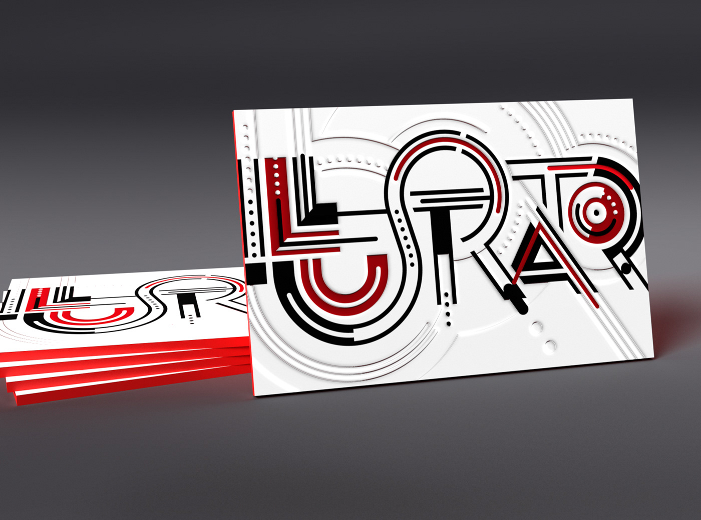
I had it printed at Flyerwire with Letterpress (the concept worked, but the letterpress is quite faint). Should repeat that in the future with quality letterpress. The tutorial of course covered how to prepare the letterpress artwork.

How to render a letterpress business card for presentation purposes was the subject of this tutorial. Result in Adobe Dimension:
The first tutorial was covering the concept and construction of this artwork.
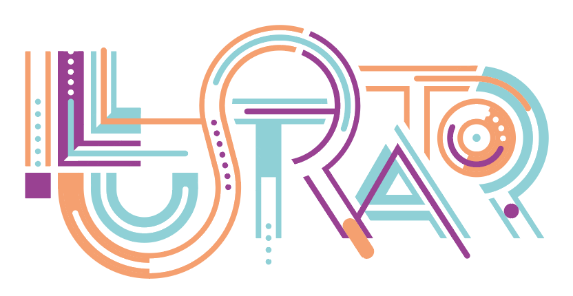
The final colored piece
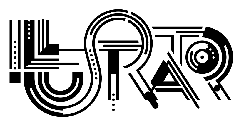
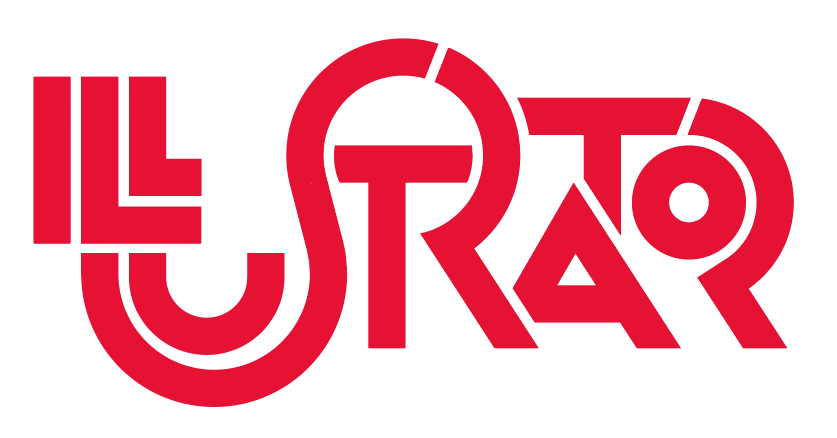
Final black and white version
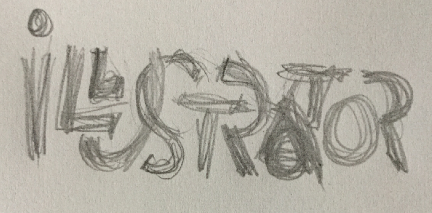
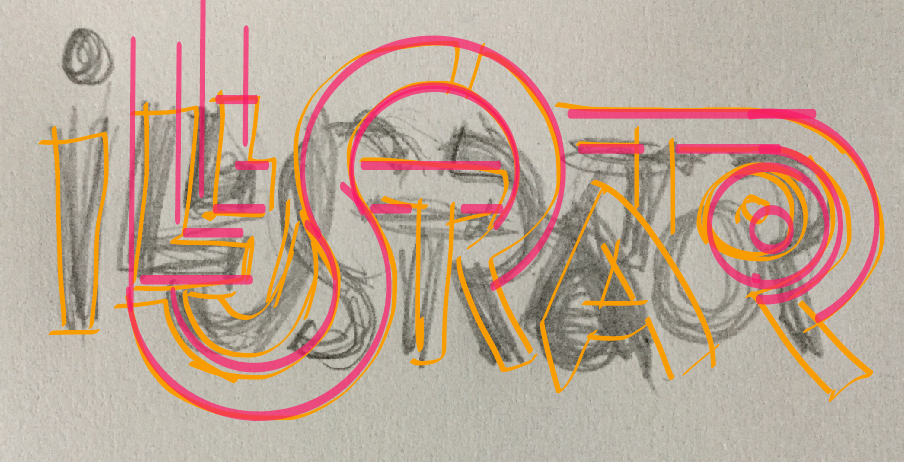
The initial sketch still resembles the graffiti style
I then took this into Adobe Illustrator Draw to try some more geometric approach and to experiment with the stacking order of the elements.

From Illustrator Draw I sent it to Illustrator to construct the base elements and then live paint it.
This is the result after live paint. It's OK, but I wanted more detail and wanted to connect the letter shapes even more as I like so much in the graffiti artwork. I went with inlines and while adding that, got this Art Deco approach.